DESIGN MANUAL
We are changing our brand image.
We are becoming more modern, more uniform, clearer, more emotional and even more concise. And above all, we are putting our customers at the center of everything we do.
We are in the middle of the process. That's why there will still be changes. But the basic concept is in place. You will already encounter the new design in some places, because we have to test and adapt it under real conditions.
The official launch will take place in November. There will be accompanying communication in advance - both internally and externally.
We would like to give you a taste of what you can expect in this short video.
Clear design. Strong brand. Consistent appearance. Our appearance is high-quality and unmistakable - just like our products. Here we show you how LIQUI MOLY becomes visible worldwide: bold, impressive and unique.
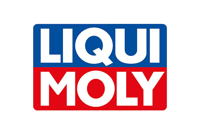
OUR LOGO.
The full-color version has priority over black and white. Shape and colors are fixed - changes are not permitted.
Our logo may be placed on all brand colors and photos. Positioning off the edge is possible as long as legibility is maintained.
Our logo is internationally protected and may only be used in accordance with the following specifications.
OUR CLAIM.
What sets us apart? Safety, reliability, performance, durability and value retention on the rational side - relaxation, pride, goosebump moments and a good feeling on the emotional side.
When drivers enjoy what they do using our products, we fulfill our mission.
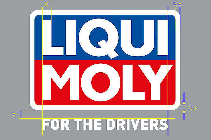
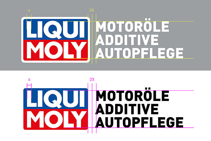
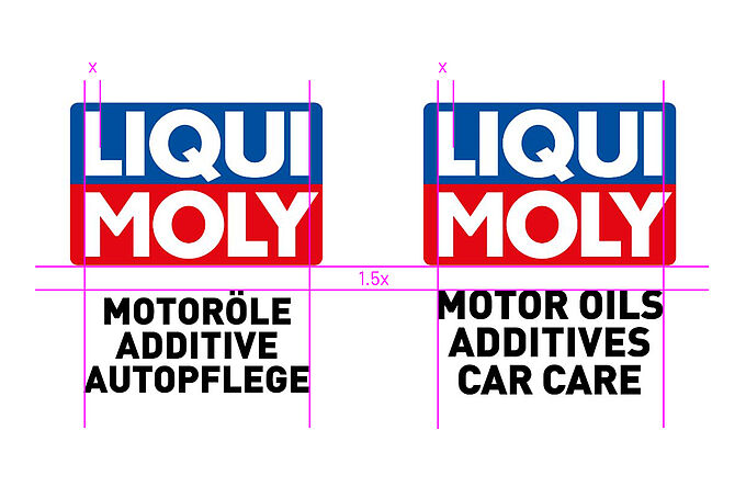
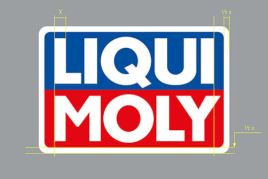
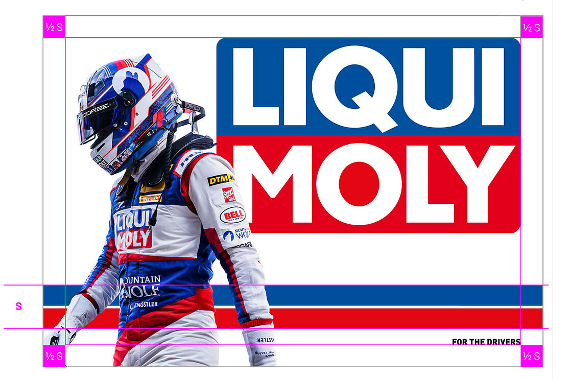
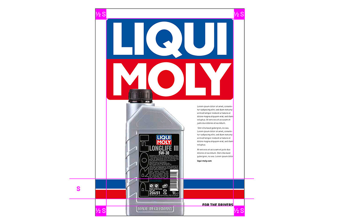
Logo spacing & sizes
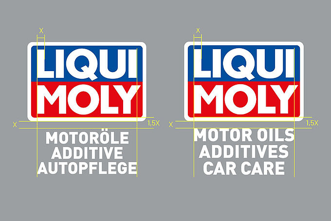
In the horizontal version, the distance between the logo and the descriptor is always 2 X, where X is the vertical line in the letter "L" of the logo.
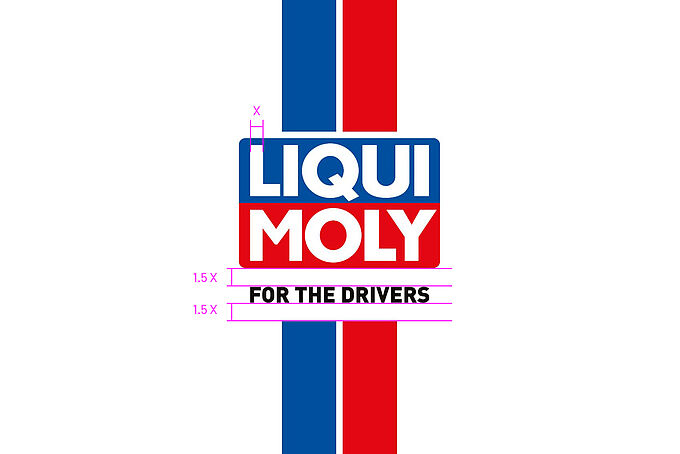
In the vertical variant, a distance of 1.5 X applies between the logo and the claim or descriptor.
It is measured from the bottom edge of the logo to the top edge of the font. In the German version up to the umlaut dots in "MOTORÖLE", in the English version up to the upper edge of "MOTOR OILS". This rule applies to all language variants and writing systems - including Cyrillic and Thai.
The shape and colors of the logo are binding and may not be changed.
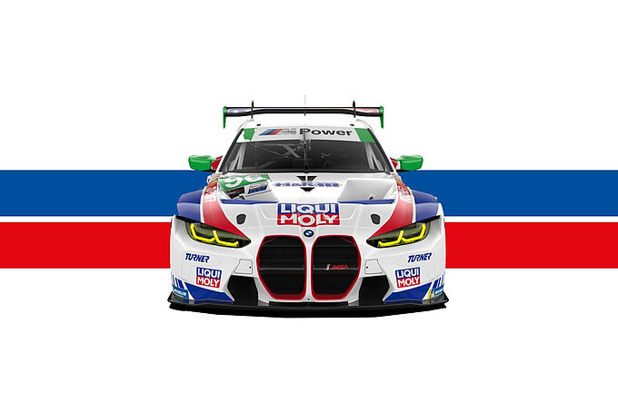
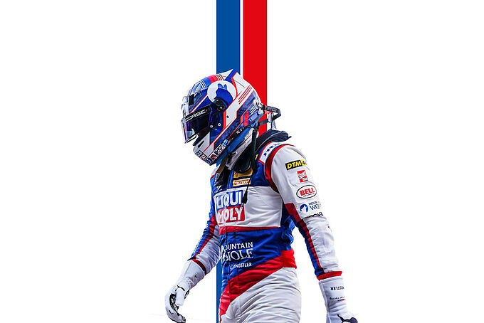
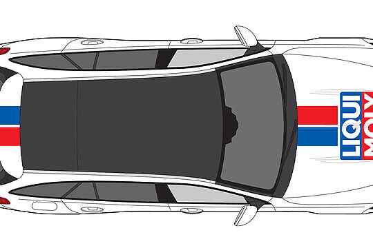
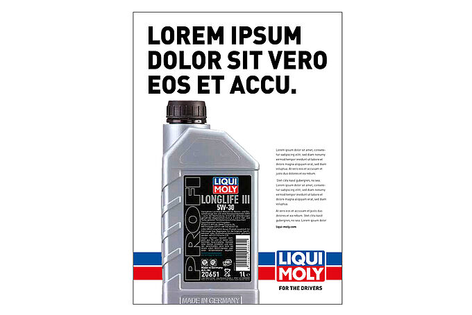
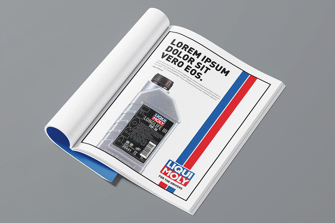
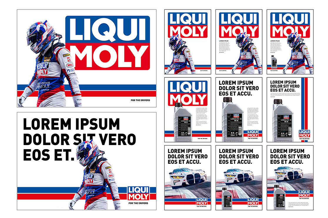
OUR RACING STRIPE.
Horizontal variant
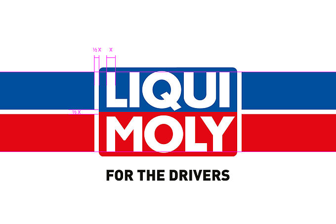
In the horizontal version, the racing stripe consists of a blue stripe at the top, a red stripe at the bottom and a white central stripe. The size ratio to the logo is defined as follows:
Top edge of blue stripe = top edge of "LIQUI"
Lower edge of red stripe = "MOLY" font line
The white dividing line and the logo outline are each ½ X wide, where X is the width of the letter "L" in the logo.
Logo placement
Only at fixed anchor points: left, centered or right. Intermediate or free placements are to be avoided.
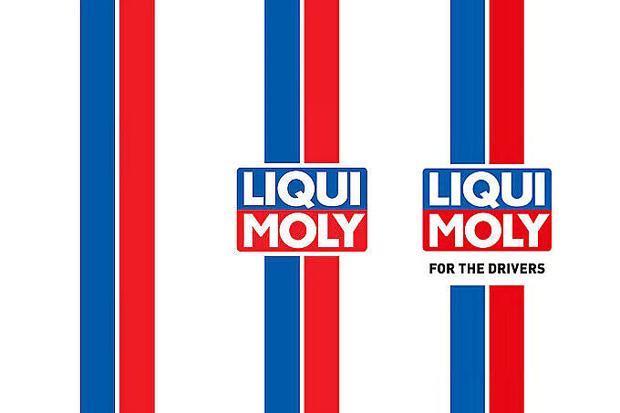
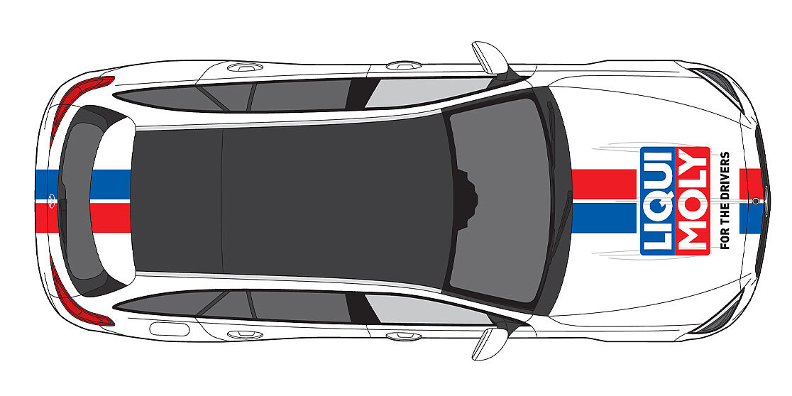
Vertical variant
The vertical version is a 90° rotation of the horizontal one. The proportions remain identical - even without the logo.
Blue stripe always on the left, red stripe always on the right. Reversing the color sequence is not permitted.
The same applies here: the white center stripe retains its width - regardless of whether the logo is used or not. This ensures visual consistency across all formats.
Design element without logo
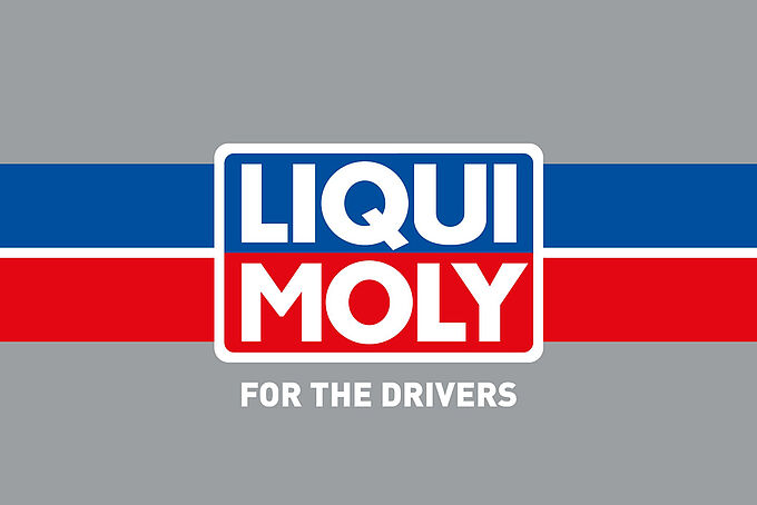
The racing stripe can also be used without a logo.
In this case, it can be used larger and more freely - depending on the layout and application.
Important: The stripe is only used horizontally or vertically. Slanted, perspective or round applications are not permitted.
OUR COLORS.


Application: logo, surfaces, text
CMYK: 100 / 70
RGB: 0 / 81 / 158
HEX: #00519E
Pantone: 286 C
HKS: 43
RAL: 5002 Ultramarine blue


Application: logo, surfaces
CMYK: 0 / 100 / 100 / 0
RGB: 226 / 0 / 26
HEX: #E2001A
Pantone: 185 C
HKS: 13
RAL: 3020 Traffic red


Application: logo, surfaces
CMYK: 0 / 0 / 0 / 0
RGB: 255 / 255 / 255
HEX: #FFFFFF
RAL: 9010


Application: text, surfaces
CMYK: 0 / 0 / 0 / 100
RGB: 0 / 0 / 0
HEX: #0B1215
Pantone: Black C
HKS: 88
OUR WRITING
With its technical origins and German DNA, it stands for legibility, timelessness and maximum recognition - from the highway sign to the brand identity.
Font hierarchy
| Use | Cut | Set |
| Headline | Black | VERSAL |
| Subline | Bold | VERSAL |
| Body text | Regular | mixed |
| Small print | Light/Regular | mixed |
Running width/distances
Depending on their size, headlines and sublines have a slightly negative spacing (-10 to -20) and narrow line spacing (90 - 100 %).
Body text has a neutral spacing of 0 and generous line spacing for better readability (130 - 150 %).
Adjust the spacing according to the format to maintain the visual balance. Optical spacing is used for font sizes above 15 pt. and metric spacing below.

OUR VISUAL LANGUAGE.
OUR DESIGN.
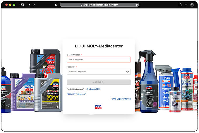
OUR MEDIACENTER.
The online platform supports you with guidelines and information about our brand, is accessible worldwide and makes it easier for you to work within our corporate design. To use our media center, a one-time registration is required in advance.


