DESIGN MANUAL
We are changing our brand image.
We are becoming more modern, more uniform, clearer, more emotional and even more concise. And above all, we are putting our customers at the center of everything we do.
We are in the middle of the process. That's why there will still be changes. But the basic concept is in place. You will already encounter the new design in some places, because we have to test and adapt it under real conditions.
The official launch will take place in November. There will be accompanying communication in advance - both internally and externally.
We would like to give you a taste of what you can expect in this short video.
Clear design. Strong brand. Consistent appearance. Our appearance is high-quality and unmistakable - just like our products. Here we show you how LIQUI MOLY becomes visible worldwide: bold, impressive and unique.
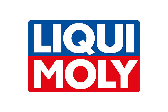
OUR LOGO.
The full-color version has priority over black and white. Shape and colors are fixed - changes are not permitted.
Our logo may be placed on all brand colors and photos. Positioning off the edge is possible as long as legibility is maintained.
Our logo is internationally protected and may only be used in accordance with the following specifications.
OUR CLAIM.
What sets us apart? Safety, reliability, performance, durability and value retention on the rational side - relaxation, pride, goosebump moments and a good feeling on the emotional side.
When drivers enjoy what they do using our products, we fulfill our mission.
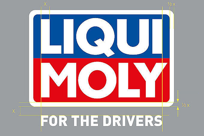
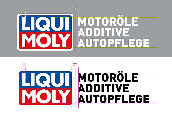
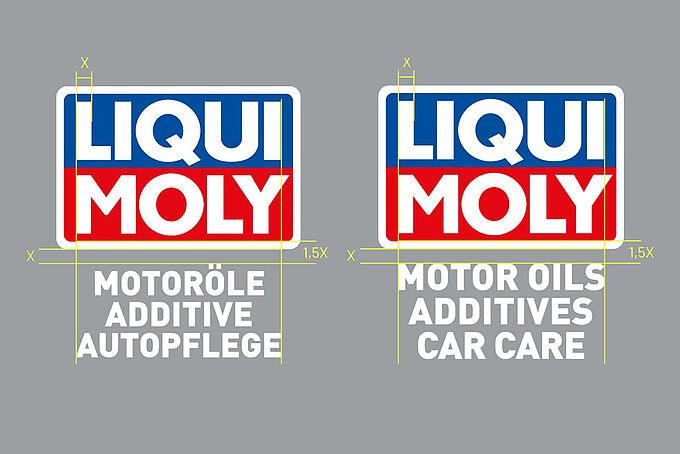
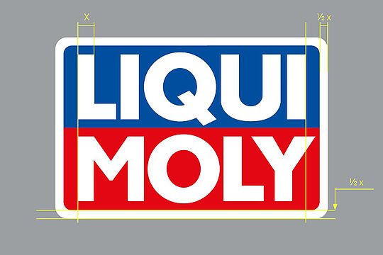
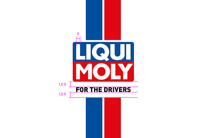
Logo spacing & sizes
In the horizontal version, the distance between the logo and the descriptor is always 2 X, where X is the vertical line in the letter "L" of the logo.
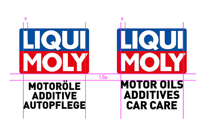
In the vertical variant, a distance of 1.5 X applies between the logo and the claim or descriptor.
It is measured from the bottom edge of the logo to the top edge of the font. In the German version up to the umlaut dots in "MOTORÖLE", in the English version up to the upper edge of "MOTOR OILS". This rule applies to all language variants and writing systems - including Cyrillic and Thai.
The shape and colors of the logo are binding and may not be changed.
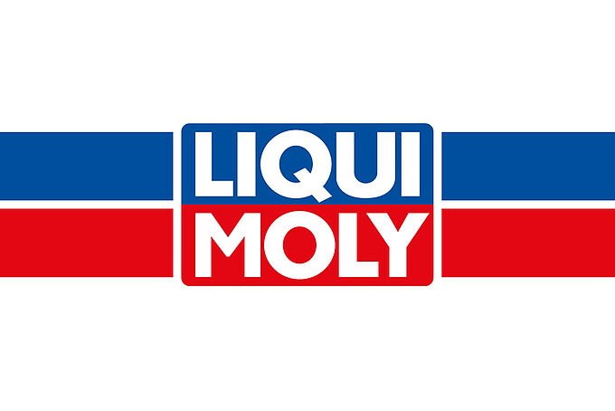
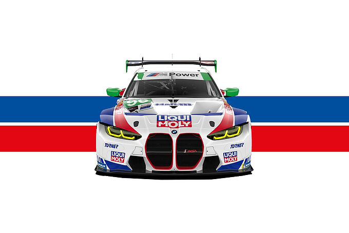
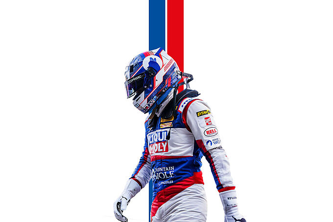
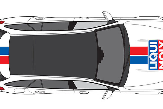
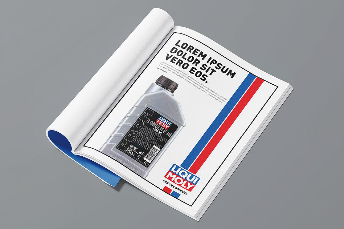
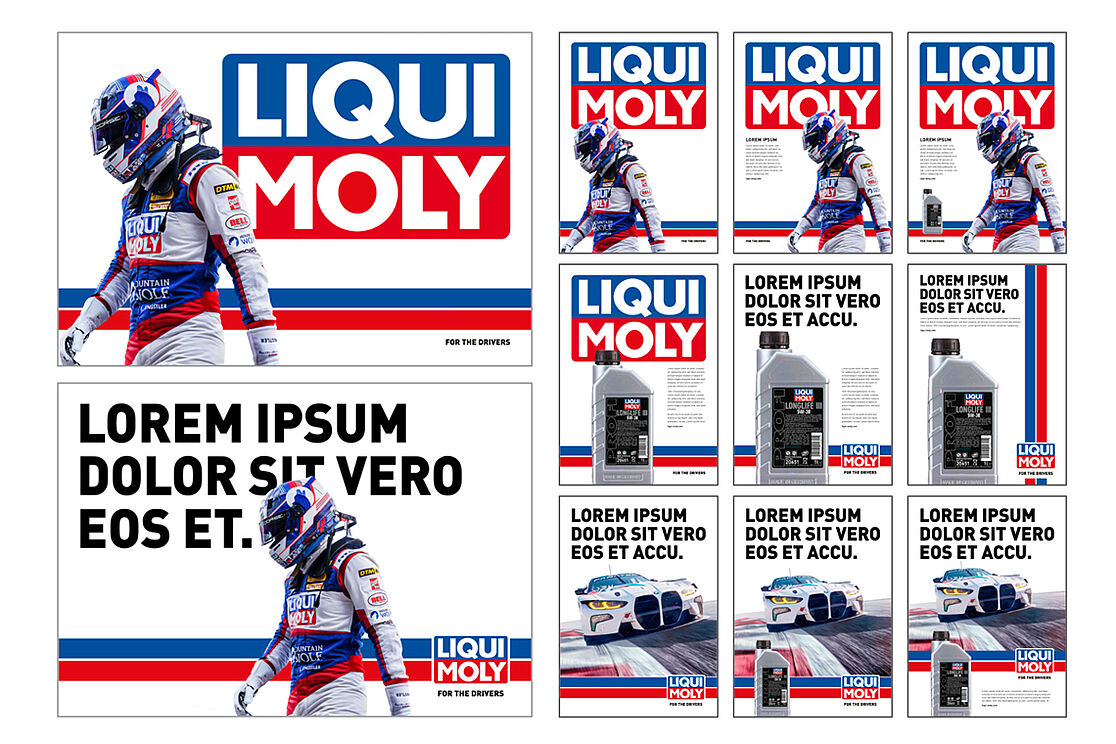
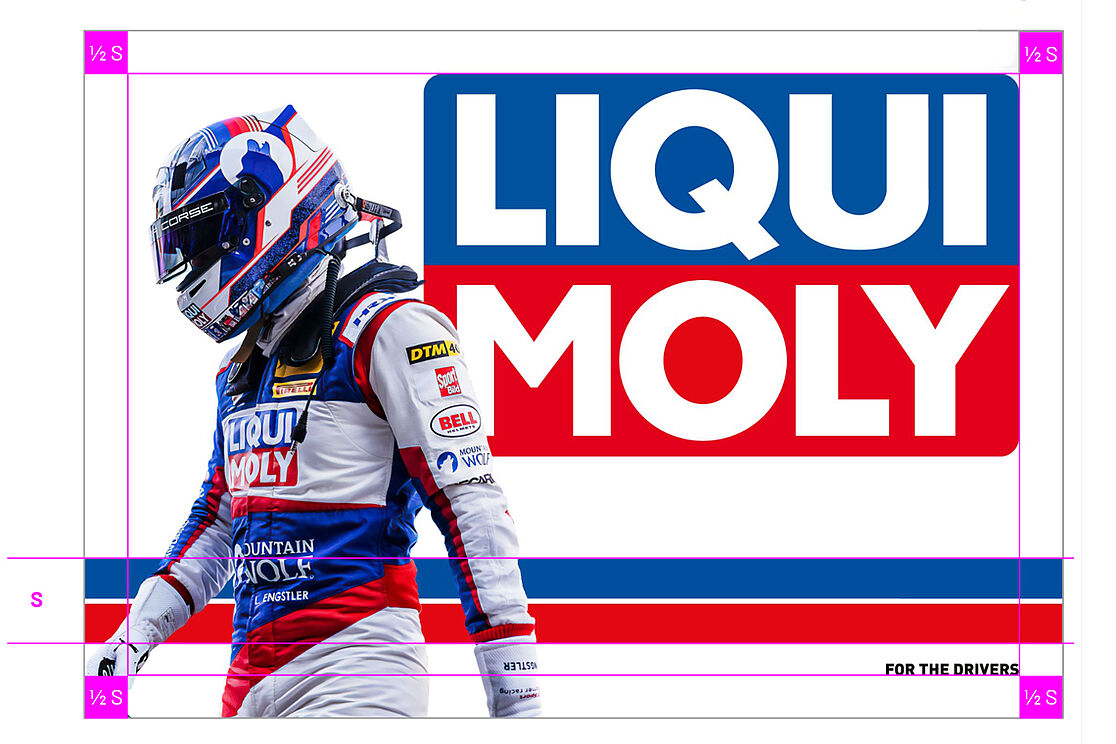
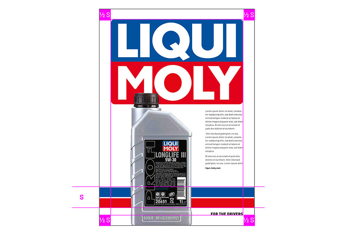
OUR RACING STRIPE.
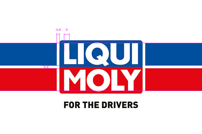
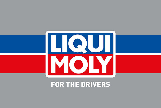
Horizontal variant
In the horizontal version, the racing stripe consists of a blue stripe at the top, a red stripe at the bottom and a white central stripe. The size ratio to the logo is defined as follows:
Top edge of blue stripe = top edge of "LIQUI"
Lower edge of red stripe = "MOLY" font line
The white dividing line and the logo outline are each ½ X wide, where X is the width of the letter "L" in the logo.
Logo placement
Only at fixed anchor points: left, centered or right. Intermediate or free placements are to be avoided.
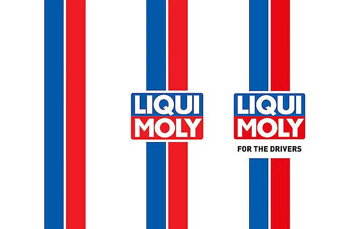
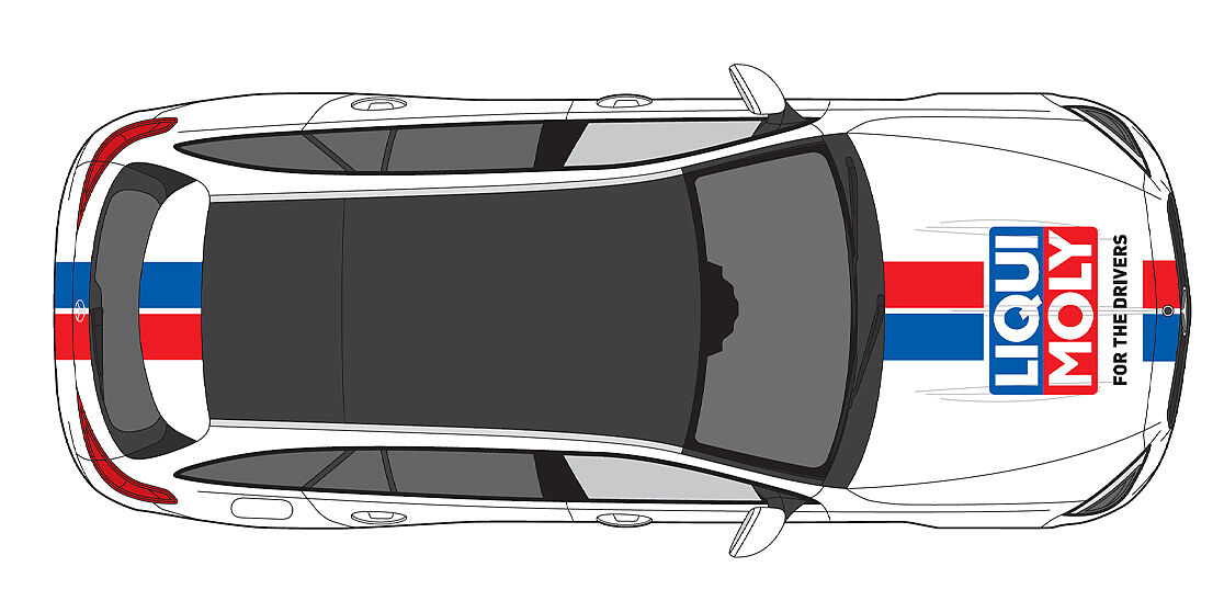
Vertical variant
The vertical version is a 90° rotation of the horizontal one. The proportions remain identical - even without the logo.
Blue stripe always on the left, red stripe always on the right. Reversing the color sequence is not permitted.
The same applies here: the white center stripe retains its width - regardless of whether the logo is used or not. This ensures visual consistency across all formats.
Design element without logo
The racing stripe can also be used without a logo.
In this case, it can be used larger and more freely - depending on the layout and application.
Important: The stripe is only used horizontally or vertically. Slanted, perspective or round applications are not permitted.
OUR COLORS.
Application: logo, surfaces, text
CMYK: 100 / 70
RGB: 0 / 81 / 158
HEX: #00519E
Pantone: 286 C
HKS: 43
RAL: 5002 Ultramarine blue
ORACAL: Blue 049 - matt laminated
Application: logo, surfaces
CMYK: 0 / 100 / 100 / 0
RGB: 226 / 0 / 26
HEX: #E2001A
Pantone: 185 C
HKS: 13
RAL: 3020 Traffic red
ORACAL: Red 028 - matt laminated
Application: logo, surfaces
CMYK: 0 / 0 / 0 / 0
RGB: 255 / 255 / 255
HEX: #FFFFFF
RAL: 9010
Application: text, surfaces
CMYK: 0 / 0 / 0 / 100
RGB: 0 / 0 / 0
HEX: #0B1215
Pantone: Black C
HKS: 88
OUR WRITING
With its technical origins and German DNA, it stands for legibility, timelessness and maximum recognition - from the highway sign to the brand identity.
Font hierarchy
| Use | Cut | Set |
| Headline | Black | VERSAL |
| Subline | Bold | VERSAL |
| Body text | Regular | mixed |
| Small print | Light/Regular | mixed |
Running width/distances
Depending on their size, headlines and sublines have a slightly negative spacing (-10 to -20) and narrow line spacing (90 - 100 %).
Body text has a neutral spacing of 0 and generous line spacing for better readability (130 - 150 %).
Adjust the spacing according to the format to maintain the visual balance. Optical spacing is used for font sizes above 15 pt. and metric spacing below.
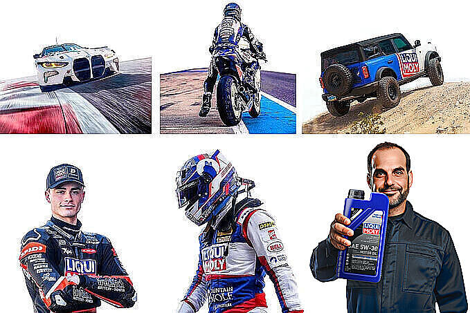
OUR VISUAL LANGUAGE.
OUR DESIGN.
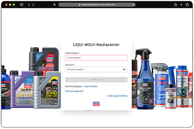
OUR MEDIACENTER.
The online platform supports you with guidelines and information about our brand, is accessible worldwide and makes it easier for you to work within our corporate design. To use our media center, a one-time registration is required in advance.
OUR TONE OF VOICE.
LIQUI MOLY or Liqui Moly - you or you? Cheeky or formal? Defining and applying a uniform tone of voice and spelling requires a lot of dexterity and a feel for language. Especially when a company is as diverse and dynamic as ours.
That's why, in addition to a clear, stringent image, consistent communication with our customers and partners is important in order to convey homogeneity, authenticity and professionalism. In addition to the corporate design, the corporate wording also has a lasting impact on the identity and image of our company.
For this reason, as part of our brand realignment, we have defined a few rules, building blocks and tools that should serve as the ideal communicative line on our path to success: the TONE OF VOICE.
AT EYE LEVEL: OUR TONALITY.
We always choose the tone of voice to suit the situation and target group: smart, relaxed and charming for image advertising and selected topics. For product advertising, press releases, technical topics and business correspondence, we tend to be clear, factual and straightforward.
We are not arrogant and do not take ourselves too seriously. In other words, we always communicate authentically and at eye level - because we take a close look and empathize with our partners and customers.
We use a "you" approach in our social media communication.
The "you" approach in all other applications.
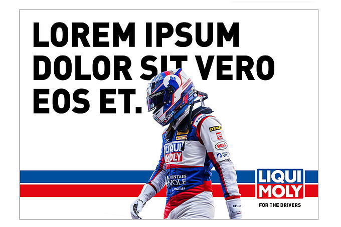
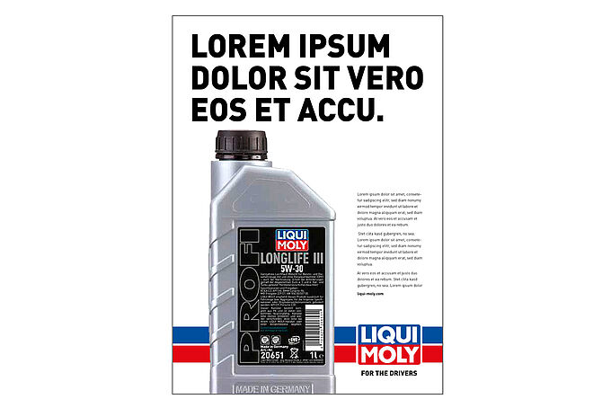
OUR CLAIM: FOR THE DRIVERS
Everything we say is based on the foundation of our company claim and pays into it - sometimes rational, sometimes emotional, always empathetic, approachable and customer-oriented. FOR THE DRIVERS is the global essence of our way of thinking and working. It verbalizes our aspiration to do everything we can to offer our customers the best possible mobility experience.
On a rational level, the claim stands for
| On an emotional level, the claim stands for
|
USE OF OUR CLAIM.
FOR THE DRIVERS is always written in capitals and without a period. We use the English-language form throughout the world, i.e. translation is not permitted.
Important: FOR THE DRIVERS is not a short-term slogan, but a long-term brand statement. The claim expresses what we stand for as a company - our claim, our values, our positioning. It is registered in the trademark register and therefore enjoys international trademark protection.
A variation such as FOR THE RIDERS is neither protected nor desired under trademark law. This would dilute our claim and open the door to further adaptations. This must be strictly avoided. The only alternative is to omit the claim if it is inappropriate. In areas where DRIVERS is not used (e.g. motorcycle, bike and marine), we do not use the claim. Instead, we work with selective, campaign-specific slogans that suit the target group. In addition, there is always the option of adding the relevant competence line to our logo.
Exception using the motorcycle example: If text animation is used (e.g. analogous to the animated roundel in our I love you video "FOR THE DREAMERS > FOR THE ENTHUSIASTS > FOR THE CRUISERS > FOR THE RIDERS > FOR THE DRIVERS), our claim can be used at the end if a clear reference to our motorcycle products was previously recognizable. In these cases, the claim does not refer to the motorcycle sector, but builds a bridge to our core positioning as a company.
USE OF OUR LOGO.
Depending on the intended use, the following logo variants can be used:
logo only
Can be used universally if the communication does not pursue a direct advertising approach and there are no trademark concerns due to the clear product context.
Logo with claim
Used whenever brand awareness is to be generated and there is a direct context to our products and/or services through the motif or headline.
Logo with competence line MOTOR OILS // ADDITIVE // CAR CARE
Used when the focus should be on our product range or when a clear reference to our product portfolio must be established in terms of trademark law.
Logo with competence line MOTOR OILS // ADDITIVE
Use as above, but only in product lines (e.g. Motorbike, Marine) and countries in which our car care range is not available. A sector-specific addition with neologisms such as MOTORCYCLE CARE or BOAT CARE is not desired.
General information on trademark law:
There must be a clear reference to our brand/products in every advertisement. We may not use other brands to showcase ours. The other brands must not overlay ours. The easiest way to do this is through a direct product reference. Otherwise by using appropriate headlines and/or our logo with a competence line.
TRADEMARK "MADE IN GERMANY".
We do not produce all products from our portfolio in Germany. It is therefore misleading for us to adorn our global logo with "Made in Germany". Only if a product is actually "Made in Germany" may we label it with this reference - but even then not in the direct context of the logo. Otherwise, the impression could arise that we generally and exclusively produce in Germany.
In addition, we now also have production sites abroad. If we were to write "Made in Germany" under the logo for products manufactured there, this would be inconsistent and incorrect. We therefore proactively and consistently leave out "Made in Germany" here.
Conclusion: The logo with the addition "Made in Germany" no longer exists. Nevertheless, especially in Germany, where we only sell oils and additives from Germany, we can work with the "Made in Germany" label.
UNIFORM: OUR SPELLINGS.
We put a period.
We always put a period after headlines, sublines and copy. Exceptions: Our claim FOR THE DRIVERS and headlines that consist exclusively of product names or categories do not require a period.
Headlines and sublines.
We only write headlines and subheadlines in capital letters. Due to the mandatory legal requirements regarding digital accessibility, exceptions are only permitted on our website.
LIQUI MOLY not in headlines.
We are self-confident and therefore do not engage in name-dropping. Our logo and design are concise enough and are completely sufficient as a strong sender.
Spelling.
We write LIQUI MOLY in capitals and without a hyphen. Always and everywhere.
Word combinations with LIQUI MOLY.
Word combinations with our company name are always hyphenated (e.g. LIQUI MOLY products, LIQUI MOLY customers, etc.)
Word combinations.
Always spell words together if possible (oil service instead of oil service, gasoline additive instead of gasoline additive, etc.). Avoid hyphens in order not to interrupt the reading flow. Exceptions should only be made if legibility or comprehensibility would no longer be ensured or if a part of a word is to be deliberately emphasized.


